Lightury
Premium light salon branding
I designed a luxurious branding for a premium light salon, using negative space technique.
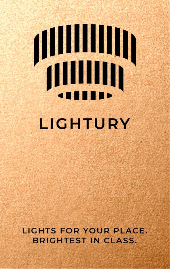
The company name is a clever combination of the words "Light" and "Luxury," and this essence will be reflected in the logo. By utilizing negative space, the design will allow the eye to complete the picture, evoking curiosity and engagement.
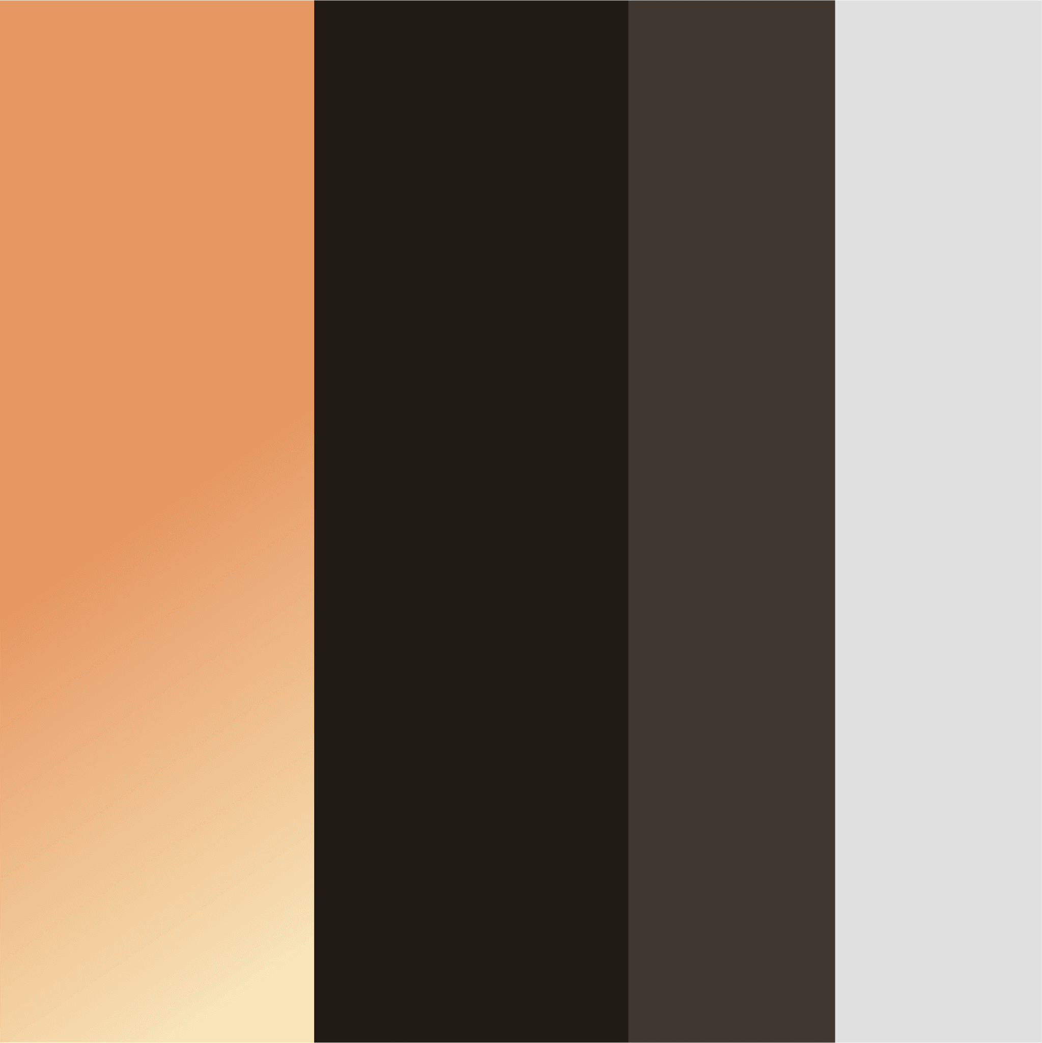
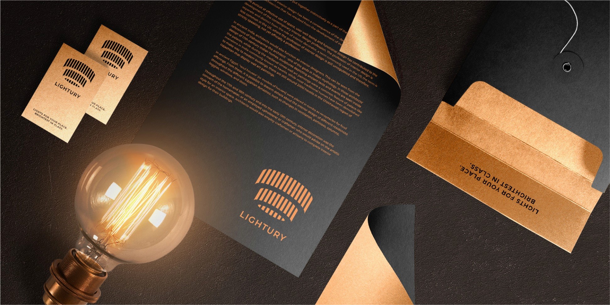
The overall concept involves contrasting mysterious dark backgrounds with bright elements of identity, forging a connection to the brand's history while immersing customers in a luxurious atmosphere. This approach will not only capture attention but also create an aura of sophistication and exclusivity.
Through the strategic use of negative space, the logo design and branding will convey a sense of elegance and refinement, setting the premium light salon apart from its competitors. The interplay of light and dark, balanced with the right amount of bright accents, will create a visual experience that resonates with customers and aligns with the brand's promise of luxury.


