
identity / strategy / packaging / social
Dynamic and reliable brand identity for a company that assists individuals in enhancing their health and lifestyle through premium supplements, podcasts, and online programs.
Human Optimization uses a combination of light and dark neutrals to create an elegant brand that seamlessly integrates sacred geometry and modern elements, ensuring the production of top-tier products and delivering an exceptional customer experience…

Hummingbird
logo / print
Logo for a San Francisco music school that is a creative blend of an image representing the Anna's hummingbird — a native bird species in California — and a musical clef. This design aims to evoke emotions and create an inviting atmosphere, inspiring people of all age groups to pursue their musical education.


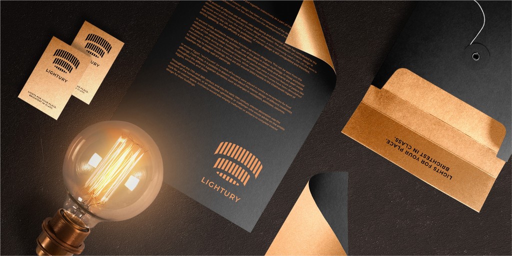
identity / strategy / packaging / social
I designed a luxurious branding for a premium light salon, using negative space technique.
The company name is a clever combination of the words "Light" and "Luxury," and this essence will be reflected in the logo. By utilizing negative space, the design will allow the eye to complete the picture, evoking curiosity and engagement…
Wonder Home
Kitchenware Brand Logo
A simple, memorable and inventive logo for a modern kitchenware brand. Wonder Home’s products are ergonomic and multifunctional, full of wonderful features. The wonder of this design is the shape of a house that’s hidden in Negative Space between letters W and H.


identity / strategy / packaging / social
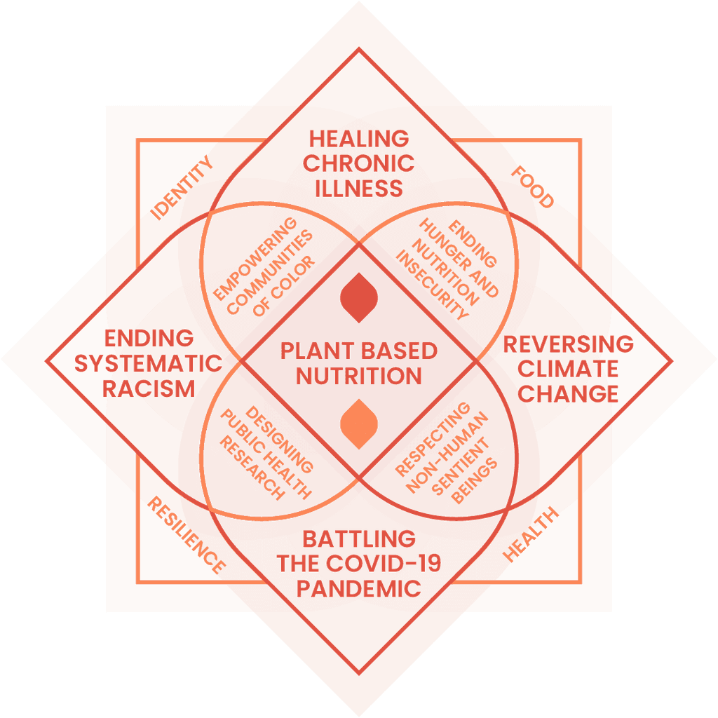
Brand Identity for Jiviniti, an organization that utilizes evidence-based strategies to promote lifestyle changes that support the holistic health of the planet, humans, and animals.
Additionally, they engage in conscious communications campaigns to raise awareness and promote positive changes…
Beamjobs
Logo for a Go-to Platform for Job Seekers
Logo for a startup initially specialized in resume building services but later evolved into a comprehensive platform for job seekers. It helps users in navigating the complex terrain of resumes, job listings, and interviews.


identity / strategy / packaging / social
Brand Identity for Wisebet, a Web3 startup revolutionizing sports betting by eliminating the house and providing a transparent and fair platform.
The brand identity of Wisebet is characterized by its dark neutral backgrounds, contrasting gradients, and a visually appealing low poly aesthetic. These design elements contribute to the overall modern and dynamic look of the brand…


identity / strategy / packaging / social
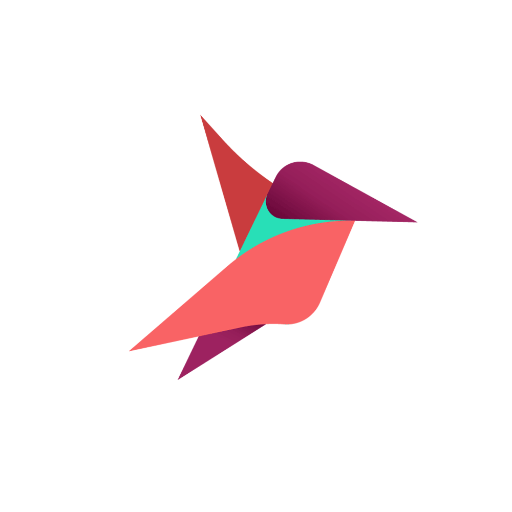
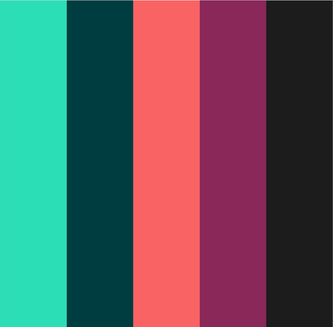
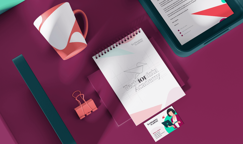
A vibrant and heartfelt Brand Identity for an IT academy from Netherlands.
The core of our brand is a hummingbird, representing agility, curiosity, and enjoyment in the pursuit of knowledge. The hummingbird can be found on all of the brand materials and serves as a dependable companion on Techionista's journey of continuous learning…

Whale&Wolf
Natural Soap Brand Logo
The Whale&Wolf brand logo depicts an intertwining of a Whale and Wolf in a Yin Yang style. It represents unity and serenity, appealing to mindful millennials who prioritize the quality of their skincare products. This logo helps foster special connections between the brand and its customers.


identity / strategy / packaging / social
Luxurious Brand Identity for a Canadian company LUA that pays homage to Moroccan heritage and a commitment to the well-being of people and the natural environment.
At the heart of their brand is an elegant wordmark, meticulously designed with delicate, thin lines and geometric forms…
Beamjobs
Logo for a Go-to Platform for Job Seekers
Logo for a startup initially specialized in resume building services but later evolved into a comprehensive platform for job seekers. It helps users in navigating the complex terrain of resumes, job listings, and interviews.